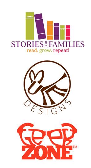
At Motate Media we are about simplicity. We are constantly defining the fundamentals as we seek to better serve our clients. We nailed down these four principles as our logo design philosophy.
- Your company logo should be not just memorable, but UNFORGETTABLE! We love logos that make people look twice and have layers of meaning.
- Your company logo should look good in color and in black and white! How will your logo look if it is photocopied? Make sure your branding sticks when the colors are washed away.
- Your company logo should look great really BIG, but also really small. Your logo should look great on a billboard, but also in a favicon (that tiny image in the browser tab.)
- Your company logo should capture the essence of your company. The words that describe your company should also describe your logo.
